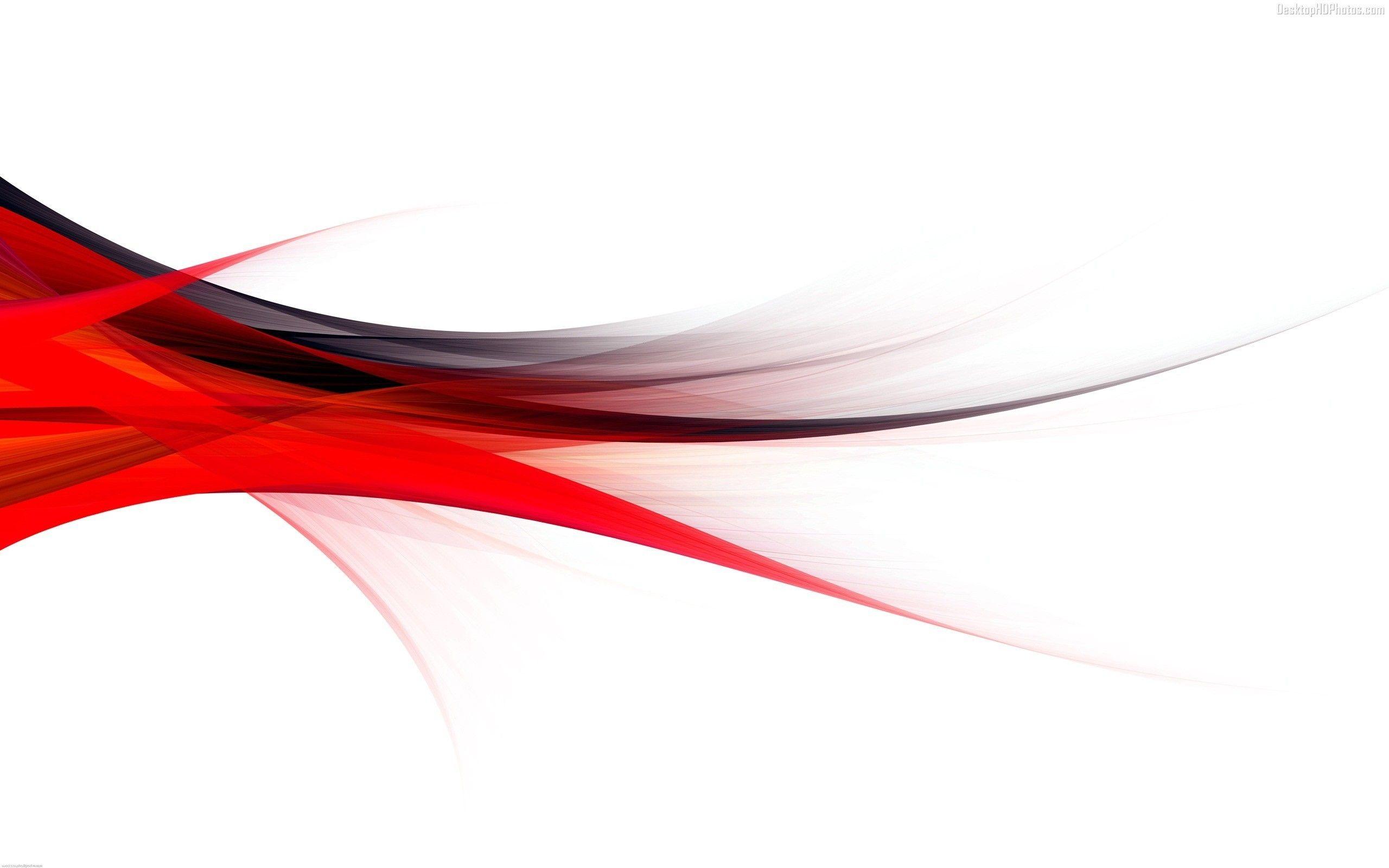
10 Stunning Red And White Color Combinations For Your Next Project


Are you ready to set hearts racing? Red and white color schemes are not just a classic combo; they’re a vibrant, eye-catching duo that can elevate any project. Whether you're planning a wedding, sprucing up your home, or diving into graphic design, these color palettes bring a sense of passion and purity that’s hard to resist. Let's explore 10 stunning red and white color combinations that will inspire your next creative endeavor!
1. Classic Elegance: Deep Red & Crisp White
This combination is like a timeless love story. Think of a deep crimson paired with a bright, clean white.
- Use Cases: Perfect for weddings, this color scheme exudes romance and sophistication.
- Tip: Incorporate deep red roses and white linens for table settings that wow guests.
Why It Works:
The boldness of deep red contrasts beautifully with the freshness of white, creating a striking visual that’s both elegant and inviting.
2. Bright and Cheerful: Cherry Red & Soft White
If you're looking for a playful vibe, cherry red and soft white are your best pals.
- Use Cases: Ideal for children’s parties or festive events.
- Tip: Use cherry red balloons and soft white decorations to create a fun atmosphere.
Why It Works:
This combo brings energy and joy, making it perfect for celebrations where you want to keep things light and fun!
3. Rustic Charm: Brick Red & Creamy White
Add some rustic charm with a brick red paired with a creamy white.
- Use Cases: Great for home decor or cozy gatherings.
- Tip: Think of brick red accent walls with creamy white furniture for a warm, inviting space.
Why It Works:
The earthy tone of brick red combined with a soft cream creates a cozy feel, making it perfect for homes that want to blend warmth with style.
4. Bold and Modern: Scarlet Red & Bright White
Looking for something that screams modern chic? Scarlet red with bright white is the way to go.
- Use Cases: Perfect for graphic design or contemporary branding.
- Tip: Use this palette for logos or website designs to grab attention and convey a modern identity.
Why It Works:
Scarlet is vibrant and attention-grabbing, while bright white keeps it fresh and clean, making your designs pop!
5. Vintage Flair: Burgundy & Off-White
For a touch of nostalgia, consider burgundy paired with off-white.
- Use Cases: Ideal for vintage-themed weddings or retro parties.
- Tip: Use lace tablecloths in off-white with burgundy accents for a beautiful vintage look.
Why It Works:
Burgundy offers a rich, deep color that evokes warmth, while off-white softens the palette, making it feel welcoming and nostalgic.

6. Festive Spirit: Red & Snow White
Perfect for the holiday season, this combination brings the Christmas spirit to life!
- Use Cases: Excellent for holiday events and decorations.
- Tip: Use red ornaments on a snow-white tree for a classic holiday look.
Why It Works:
The contrast between the bold red and the pure white evokes feelings of joy and festivity, making it an instant crowd-pleaser!
7. Playful Contrast: Fire Engine Red & Soft White
Fire engine red is bold and bright, ideal for capturing attention.
- Use Cases: Great for children’s products or playful branding.
- Tip: Use this combo for packaging designs to stand out on shelves.
Why It Works:
The vibrant fire engine red paired with soft white creates a playful contrast that feels lively and dynamic.
8. Elegant Minimalism: Ruby Red & Ivory
Minimalist designs can still pack a punch with ruby red and ivory.
- Use Cases: Perfect for upscale branding or sleek interior designs.
- Tip: Use ruby red accents against an ivory backdrop for a refined look.
Why It Works:
Ruby red adds a touch of luxury, while ivory maintains a clean and sophisticated aesthetic, perfect for elegant settings.
9. Whimsical Touch: Raspberry Red & Pale White
Add a twist with raspberry red and pale white for a whimsical vibe.
- Use Cases: Ideal for creative projects and artistic branding.
- Tip: Use this palette in illustrations or playful packaging designs.
Why It Works:
Raspberry red is vibrant and fun, while pale white softens the look, making it approachable and playful.
10. Cultural Heritage: Red & White for Traditional Themes
This classic pairing is steeped in cultural significance, especially in various traditions.
- Use Cases: Valuable for cultural events and ceremonies.
- Tip: Incorporate traditional patterns using red and white, like those seen in folk art.
Why It Works:
Red often symbolizes joy and celebration in many cultures, while white represents purity, making this combo meaningful and festive.
Conclusion: Choose Your Palette Wisely!
There you have it—10 stunning red and white color combinations that can transform your project from bland to grand! Whether you're going for elegance, playfulness, or a touch of nostalgia, these palettes have something for everyone. Remember, the key is to choose a combination that resonates with your audience and the message you want to convey.
So, which red and white color scheme will you choose for your next project? Dive in, get creative, and let your imagination run wild! And if you ever need more inspiration, don’t hesitate to revisit these combos. Happy designing!
